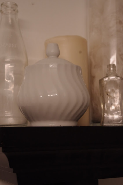
Somewhat recently, a bathroom hardware manufacturer's ad hinged upon the phrase "[B]athroom as still life? Bathroom as real life." The premise of the commercial was to show that the company's faucets were works of art--that's what they wanted you to think about. If you know me, you understand that I tend to think outside the box; I took the commercial as a very literal idea that bathrooms can be artistic.
Because bathrooms are generally much smaller than other rooms in a house, they often feature intricacies that can't be found elsewhere. Everything in a bathroom must be proportional to the room itself, thus giving us small, detailed objects that make up the room. I am a very detail-oriented person, so rooms that revolve around seldom-noticed details interest me particularly.
All that is to explain why I am posting pictures of a bathroom on my blog about photography. This past week, my mother and I painted and redecorated her bathroom in our house. Typical of the 1970's, the narrow bathroom featured a fair amount of tile work and ordinary cabinets. The hexagonal tile work is both is best and worst feature, in that it is a beautiful geometric pattern in a somewhat boring room, but also a very unfortunate pale yellow in color. After brainstorming for a few days, we decided on a very simple color palate of black, white, and yellow. The end result is a somewhat basic bathroom with lots of small details that set it apart. I thought it was a perfect opportunity to try out the new camera and write about something other than peoples' portraits.
Enjoy,
JM


No comments:
Post a Comment